
Happy Friday everyone! Once again this week we will be participating again in Let’s Talk Bookish, where we discuss a topic suggested by the lovely community. Let me once again reference their little blurb below, please follow them and feel free to leave your own suggestion and prompts for next month while you’re over there!
Let’s Talk Bookish is a weekly meme, hosted by Rukky @ Eternity Books & Dani @ Literary Lion, where they discuss certain topics, share their opinions, and spread the love by visiting each others’ posts.
Prompt for Feb 12:
It’s impossible not to sometimes judge books by the cover – what makes a book beautiful to you? Are there certain covers you’re drawn towards, and certain styles you stay away from? What are some of the most beautiful covers you’ve seen?
It’s definitely impossible not to sometimes judge books by the cover, but honestly I lean into it – why not? I don’t see what’s wrong with judging books by its cover, unless you’re choosing not to read one purely off how the cover looks – that would be strange. But isn’t it only natural to pick up a book that looks attractive? I have always wondered this. Let me know below if you don’t see the big deal of judging a book by it’s cover! I think the real message is more like: don’t only judge a book by it’s cover, right?
Ironically, even though I have been reading more books recently, I have been mostly reading off eReaders or on my phone. Ergo, I don’t really see book covers – at least not in real life. But moving onto the actual question, I do like a variety of book covers! Of course the beautifully illustrated artworks are nice, but also simple geometric or minimalistic designs also appeal to me. Here is an example of that:

I feel like this cover really fits that simplistic yet cool design with the whole mirrored effect (even if it’s not a true mirror image). When I first saw this, I was definitely intrigued and wondering, what might this book be about? And if you read our anticipated books of Feb 2021 post, you would know that I am indeed looking forward to this book! But this cover though, yes please.

Another one from our anticipated books for February, but I also enjoy this beautiful Norse mythology inspired design. these kinds of illustrations really speak to me, and make me want to pick it off the shelf! Any book that makes me want to pick it up classifies it as a beautiful book, for me.
As for styles I would stay away from… I really wouldn’t say there are any covers I would specifically not pick up. There are certain covers I just wouldn’t gravitate towards, such as:
Like I’m sorry, I enjoyed this book, and luckily I wasn’t reading a physical copy, but this kind of design cover with a non-descript background (seemingly meaningless) and just big block text is really not the kind of design that entices me. I still completely enjoyed this book (stay tuned for the review!) and would recommend it, but I can definitely say its cover wasn’t a selling point for me. I read its synopsis and decided to give it a try, and I have no regrets, so even if I don’t like its cover, it really didn’t affect my opinion of the book.
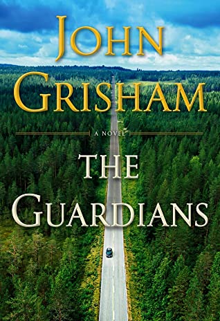
As much as I look at and judge covers, I pick many up, read the synopsis and put it back down, so it’s actually hard for me to remember beautiful covers that I’ve seen. Unsurprisingly, I actually like a lot of mystery/thriller novel covers. They’re usually a little bit suspenseful and creepy, and just gives me those you-know-it’s-a-thriller vibes.
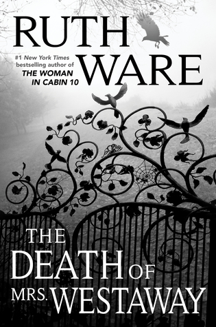
Like c’mon, tell me that doesn’t scream thriller. I would say this kind of design definitely appeals to me. I like it when a book kind of gives you a glimpse of what you might find inside, and these kinds of covers just promise a great thriller (and usually do!). I find that it just really helps to set the whole mood of the book if the cover also matches the theme. It gives it more of the holistic feel. Of course it doesn’t have to match. But covers (and also titles!) have a huge impact on how the book is framed, as it’s literally the first thing you see and read. I definitely appreciate it when an cover is well thought out, and reflects what might be inside, or provides something to contemplate while reading the book.
Of course, a literal interpretation is also evocative. When I read a title and see that the cover is a literal representation of its title, that is definitely also extremely captivating, as doubling up on the meaning gives it that little extra bit of emphasis:

I just love it. It really gives it that extra oomph. Reminds me of those puzzles that use pictures to depict an idiom literally. So much fun. And if you haven’t seen our review for The Woman in the Window, go check it out. Spoiler alert: it’s rated 5 Drink Me Potions, and Andge and I both give our opinions on it! For me, this book definitely stood out on the shelf at the local bookstore, and fun fact, Andge helped buy this book for me. Just the cherry on top that it happens to have a great cover and be a great story as well.
And that’s a wrap from me for this week! Hopefully you enjoyed my insight into book covers. What are your opinions? Do book covers matter? A lot, or not at all? Feel free to discuss and comment below, and once again don’t forget to follow the original creators!

I love the cover for The Witch’s Heart, it’s so beautiful! ❤ I agree that a beautiful book is just a book whose design makes me want to pick it up.
LikeLiked by 1 person
I think judging books by their covers is inevitable. I try not to let my judgment of them guide me too much. I guess it doesn’t matter really because I’m still likely to learn more about a book with a cover I don’t find really pretty if the title is interesting enough. But books with covers that I think are plain old ugly or just very lacking, I do tend to ignore them and move on.
And yes! Thrillers/mysteries and historical fiction novels have such distinctive cover styles, you know almost right away that they’re from either genre. That helps entice me when I’m looking for books in those genres. Wonderful post!
LikeLike